Good Morning Blog,
Today in class, I decided to research color schemes. Creating a color scheme gives identification to the brand and makes it visually appealing.Therefore, maintaining a color connection with your audience is just as important as delivering good content. Below are my survey results to y question regarding color schemes:

In my results, majority of my audience (over 50%) was in favor of a Bold/Neon color palette. One participant even said that "I feel like bold or neon because they would go well with the powerful message of my magazine. I agree with my audiences choice, and look forward to incorporating their suggestions into my piece keeping in mind the meaning behind each color.
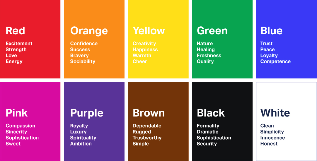
COLOR PALETTE:


WELL KNOWN EXAMPLES:

The color scheme of this magazine cover could be described as giving off a more girly look and very bold with the Hot pink, bright blues and yellows. This magazine can be assumed to appeal to girls especially of the earlier age hence the bright color palette, and the large cover image of a beloved boy band.

The color scheme of this magazine color is very minimalistic. Notice how the background is white, with hints of black from the subjects shadow, and even her white clothing are used as a subtle yet effective baseline. Then, the bright pink of the mast head and subtitles bring the cover together and provide the pop of color it was missing.


No comments:
Post a Comment